

DLB Careers Website
The design of DLB Associates’ new dedicated careers website provides a streamlined, engaging, and accessible experience for job seekers.
By prioritizing usability and performance, it enhances recruitment efforts while laying the foundation for broader digital improvements as they gradually approach larger initiatives such as redesigning their main website.


Project Overview:
The Client:
DLB Associates is an engineering consulting firm with a 40+ year history, specializing in innovative and sustainable solutions for data centers and mission-critical facilities. For a company that prides itself on technical expertise and forward-thinking solutions, a website is an essential and powerful marketing tool to demonstrate their values and capabilities to clients and candidates looking to join the team.
The Problem:
DLB’s 2024 website significantly hindered the company's ability to attract new business and top-tier talent as they scale up in a competitive industry. The design suffered from several major usability and performance issues, including:
Slow Page Load Times (over 8 seconds)
Unclear Navigation & User Journey
Poor Responsiveness
Disruptive Interactive Elements
Lack of Clear Call-to-Action (CTA)
SEO and Discoverability Issues
Despite the website issues, the DLB team has grown substantially in the last few years. By addressing these shortcomings, they aimed to enhance their overall digital presence, making it easier for potential clients to understand its services and for prospective employees to engage with career opportunities as they continue to expand.
Deliverables:
A new careers website design in Figma, focused on improving the user experience for complete with annotations for developer hand-off for all device types and sizes (desktop, tablet, and mobile).
Tools Used:
Figma - wireframing, design, and prototyping

ChatGPT - placeholder written content optimization

A11y Color Contrast Checker - Figma plugin for contrast ratio checking

Notion - copywriting and project management

Apple Image Playground - placeholder visual content

Phosphor Icons - Icon library with Figma plugin

Adobe Color - color palette accessibility checking tools

Stakeholders & The Team Behind the Vision:
Chief Technology Officer (CTO)
Oversees operations for software engineering projects across.

Chief Human Resources Officer (CHRO)
Primary stakeholder responsible for the direction of the dedicated careers website.

Product Owner & Business Analysis Manager (PO)
Product management specialist focused on execution feasibility and internal DevOps integration.

Internal UX Designer
The organizations sole UX professional focused on internal tools, making it necessary to bring in an external designer.

Contract UX Designer (that’s me)
I was hired as a contract UX designer to create a dedicated careers website the company planned a larger overhaul of its main website.
Project Approach
Discovery
The CTO reached out to me for a discovery call to discuss the initial idea for the careers website. They provided a project brief prior to our meeting which gave me a good sense of what they hoped to accomplish and the teams involved in making that happen. The brief also called out 4 distinct professional persona types they wanted to engage with: recent graduates/early career, mid-level/experienced, career-switchers, and military veterans.
During our meeting, we established DLB’s short term requirements for a new stand-alone careers website versus their long term goals for improving their overall digital presence as the team has been rapidly growing.
The CTO expressed confidence in moving forward and set up a second consultation with the company’s CHRO as he would be the key stakeholder for the careers website project.
In preparation for the second meeting, I created a basic wireframe proposing 3 pages for their careers website:
A primary landing page with multiple sections (about us, employee stories) making use of an anchor-link navigation for a streamlined experience with little-to-no clicking required
A fully filterable job postings search page based on optimal experience for
A template for job details pages in compliance with their ATS capabilities.
The second meeting allowed us to dive deeper into the CHRO’s desire to target 4 core persona types:
Early Career Candidates (recent graduates)
Experienced Professionals
Career Switchers
Military Veterans
The CHRO was passionate about appealing to each of these personas and we began to exchange ideas about how to best appeal to each of these users while creating a cohesive experience for all website visitors. By the end of the meeting, we arrived confirmed alignment on the approach. Shortly after, I sent the team a formal proposal which was approved and we hit the ground running.
Main Website Audit


A comprehensive audit of the existing website was conducted across desktop, tablet, and mobile to assess usability, accessibility, and performance. Key findings included:
include cards or maybe a carousel with screenshots/gifs of each problem
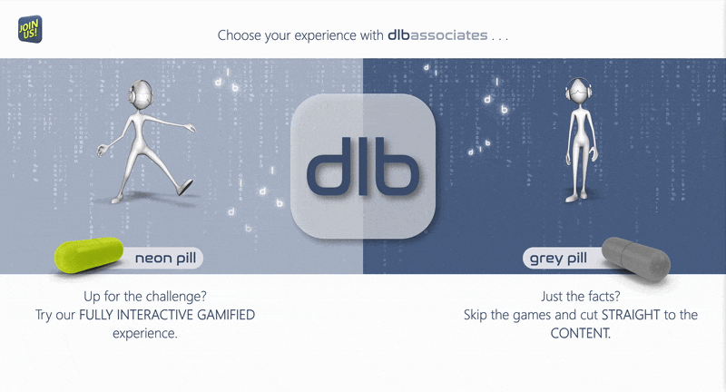
Confusing User Journey – The landing page immediately creates a friction for all visitors, forcing them to choose a gamified vs. “simplified” factual experience split instills confusion in visitors that may not know anything about the organization. Even the “simplified” version relied on oversimplified navigation and overly stylized disruptive interactive elements that require multiple clicks to access even the most basic information about the company. The structure made it difficult for users to find essential information, leading to frustration and premature exits.
Disruptive Interactive Elements – The landing page forces all visitors to choose between an interactive or static experience, adding unnecessary friction and increasing drop-off rates.
Navigation Challenges – Unconventional navigation design relying on in difficulty finding desired information.
Non-Responsive Design – Poor content scaling across different devices, especially mobile. Poor Responsiveness – The site did not responsively scale properly across devices, resulting in a poor experience for mobile and tablet users, a key audience for both prospective clients and job seekers.
Accessibility Concerns - Font size and color choices for many elements result in poor readability and general accessibility issues for visitors that may have visual impairments.
Performance Issues – Unoptimized media led to excessive load times. Slow Load Time – Heavy graphics and animations resulted in over 7-second load times, negatively impacting user retention and SEO rankings.
Lack of Clear CTAs – No clear guidance for user conversion points, making it difficult for visitors to take the next steps, such as contacting the company or applying for a job.
Brand Perception Risks & SEO Gaps – Gamification elements detracted from credibility, and result in largely non-indexable interactive content across the website. This results in unnecessarily reduced organic traffic and limiting visibility to potential customers and candidates.
I also conducted a competitive analysis, looking at the websites of a variety of DLB’s competitors in addition to careers websites for top global brands such as Nike, Tesla, Liquid Death, and more. For user flow and UI inspiration, I consulted popular websites such as Mobbin and Dribbble.
User Research
I researched each of the 4 persona types and identified both common and unique needs in their job search processes. I created a universal user flow for any jobseeker, and then defined key areas of opportunity to cater to the specific personas.
As I watched my user journey diagram branch out into a few different avenues, I began to think of “choose your own adventure” style video games and started jotting down ideas of how a similar concept could manifest on a webpage.
Branding Assets
The client team connected me with their internal visualization team to get branding materials such as logos and other visuals, as well as specifics regarding the fonts and colors they use.
Logos
Colors


Fonts

DLB brand’s primary font, used exclusively in lowercase for headings. It is the same font used for “DLB” logo.

An additional font used for section headers as an alternative to Nasalization.

Used for other headers, labels and body/descriptive text in different variations from bold through light depending on text length.
Design Process: From Concept to Execution
Phase 1: Defining Structure & Experience
This phase laid the foundation for the careers website by focusing on research, information architecture, accessibility, and early-stage design ideation. The goal was to ensure that the new site was not only visually compelling but also functional and inclusive.
Information Architecture & UI Research: The DLB team included a rough idea of different sections they wanted the for the new careers website, referencing a few examples of a few popular brands’ career websites that inspired them such as Nike, Tesla, and Liquid Death. I noted common traits to form a general list of best practices to approach the landing page structure.
Branding Accessibility Audit: I ran DLB’s brand colors through Adobe Color to get a sense of how the colors would manifest for anyone with visual impairments. The DLB team was excited about the overall accessibility of the new website and being user-friendly to all visitors. In alignment with this goal, I began to apply AAA and AA color contrast interactions using the brand’s color palette to the wireframes I made.

Refining the Wireframes (Early Stage Design Ideation): I mixed and matched different layouts for each section, exploring ways to balance written and visual content such as bento box design layouts and scrolling card carousels.
I immediately found myself fascinated the geometry of the DLB brand, such as the use of rounded corners and the mobile app icon “squircle” shape for the primary logo. This visual language was easy to incorporate in different forms through the early stages of the design process.
I also began exploring navigation concepts for both top and side navigation bar placement, such as the “expanding side navigation concept” illustrated below. In testing these concepts, it was clear they would ultimately become overlay menus for smaller tablet and mobile device viewports as is the case with most modern website designs.
Desktop, Tablet, and Mobile Wireframes


“Bento” Section Layout Wireframe Example

Expanding Side Navigation Concept


AI-Assisted Content Generation: The DLB team planned to address specific content for the website further down the road after a basic website design existed. In an attempt to future-proof my design, I fed their existing website copy to ChatGPT to draft engaging placeholder content for each section, as well as giving the team a start with boosting their SEO by adding more relevant keywords for jobseekers.


Feedback & Next Steps: I presented the wireframes and mid-fidelity concepts to the CHRO and PO, who responded positively:
Overall layout design felt refreshing and ideal for displaying content.
Liked the expanding side navigation menu.
I also shared an draft of my video-game-character-selection-screen-inspired idea for an interactive carousel of the 4 different persona types (see below) which both the CHRO and PO said they would be interested in seeing developed further for the next design review.
The feedback reinforced that the design direction aligned well with the team’s vision, setting the stage for the next iteration.
Concept for Interactive Persona-Focused Carousel
-
![]()
General Applicants
-
![]()
Early Career / Recent Grads
-
![]()
Experienced Professionals
-
![]()
Career Switchers
-
![]()
Military Veterans


Phase 2: Refining & Testing for Impact
In this phase, the design evolved from rough concepts into a refined, polished experience. The focus was on integrating branding, refining visuals, and validating design choices through testing and feedback.
Branding Integration: Incorporated company branding while improving aesthetics. I started applying branding colors and fonts to the low-fidelity designs I created. This involved creating backgrounds for each section, as well as reusable components such as cards and buttons.

Iconography Refresh: I researched and tested a range of different icon packs before landing on Phosphor Icons. These icons worked well with DLB’s existing branding with stroke weights complementing their logos and fonts.


AI-Assisted Visual Generation: I used the Apple Image Playground app on Mac to create AI-generated avatars for each of the four user personas to replace the user icons in the interactive carousel concept presented earlier.


A/B Testing Hi-Fi Concepts: As I continued to iterated on the website, I conducted A/B tests of my layouts with 10 design professionals and 10 non-designers to determine which design choices were most pleasing to a general unbiased audience.
The Second Design Review was with the team’s Internal UX Designer, and their constructive feedback focused on navigation/information architecture, and visual refinements:
Side Navigation Complexity: The expanding side navigation concept had a lot of items and the UXD expressed concerns that users might not understand how it works.
Information Architecture Revisions: It’s worth re-evaluating the structure to ensure content flows intuitively.
L-Shaped Bento Grids: The design might be too complex for both users and development feasibility, encouraged to explore more conventional bento grid layouts that could better showcase content.
This feedback guided refinements to improve usability, clarity, and feasibility for development.
Phase 3: Finalizing for a Seamless Hand-Off
In this final phase, the focus shifted to accessible responsiveness, performance optimization, and prototype development to ensure the careers website was not only visually polished but also functional, compliant, and developer-ready.
Accessibility & Performance Testing: To refine the user experience and ensure compliance with WCAG accessibility standards, I conducted extensive and continuous usability checks and tests which led to key structural improvements particularly with the website navigation:
Navigation Overhaul:
Replaced the floating side navigation with a sticky top navigation bar for a more intuitive experience.
Adopted a “container” style layout for sections to enhance visual hierarchy.
Implemented a “frosted glass” style layer behind the top navigation items which blurs layers behind the sticky navigation to improve overall legibility and contrast while maintaining the effect of a consistent viewport for each section of the sight to promote and ensure a cohesive, single-scroll experience.

Prototype Development: Created desktop and mobile prototypes to demonstrate key differences in the design for consideration during development to ensure full live website responsiveness.
Final Presentation: Delivered the final design, developer annotations, and execution recommendations.
Results & Conclusion
By the final review of this project, client team was in alignment and satisfied with how my design choices would manifest in development to address all their goals and concerns:
Clear User Journey & CTAs: The streamlined landing page reduced cognitive load, and gently guides users through the website experience by reducing clicks required to achieve their primary goal of finding and applying for roles at DLB.
Updated Navigation & Information Architecture: With the simplicity of using a single webpage with anchor links, the overall information architecture reduces both cognitive load and performance concerns compared to websites with multiple separate pages to click through.
Responsive & Accessible Design: Following best practices for different device types and their viewport sizes paired with the use of contrast checkers throughout the design process ensured the new careers website will be user-friendly to any visitors that might have visual impairments, on any device they might be using.
Post-Development Performance Improvements:
While these results could not be measured upon the completion of my involvement in the design process, they are guaranteed given the benchmarks recorded at the start of the projects.
Significant Load Time Improvement: Each webpage of the original DLB website took approximately 7-10 seconds per page to load on fast 5G WiFi. The new website features lighter interactive elements and animations which should bring this down to less than 3 seconds.
Improved Organic Discoverability: The placeholder copy used in the design serves as a great launchpad for improved SEO performance as the team builds out their content strategy for this new website.
Bonuses:
New Design Components: As part of the project hand-off, I included details regarding each component I created and how they would manifest and behave across different device viewports such as content cards and buttons. The hand-off notes also included details around how interactions would vary across device, such as the absence of hover animations on touch devices like tablets and smartphones.
Conclusion
This project successfully addressed major usability concerns in the company's web presence, delivering a streamlined, functional, and engaging careers website. While short-term in nature, the redesign could serve as a foundation for their future website redesign and general online presence improvements and demonstrated the impact of user-centered design in corporate digital experiences.